On the dashboard: Scores > Comparison
Project Level
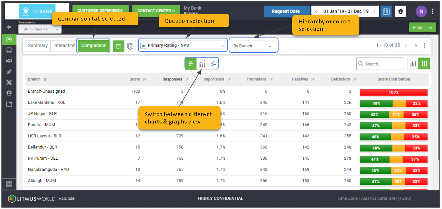
Compare across Hierarchies & Cohorts
The Comparison tab enables you to compare data for all interactions across different hierarchy levels or cohorts. Users also have the option to view comparison across different types of charts/graphs.
Views
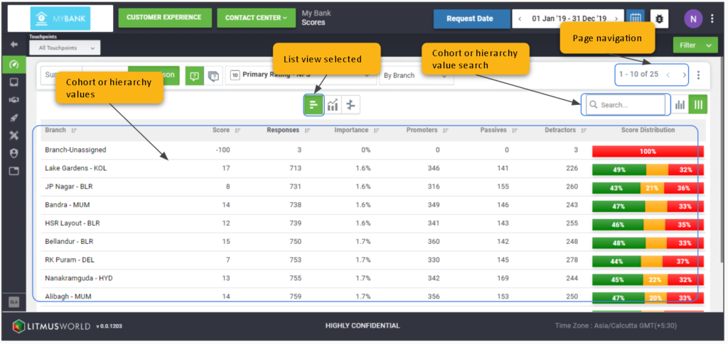
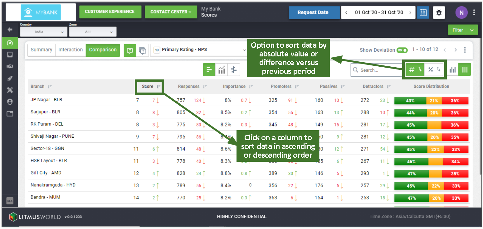
List View
Click the Graphs/Charts Icon > List View
The List shows up as the default view on Comparison tab and enables comparison by representing data in a tabular form, listing down details for the cohort or hierarchy selected in rows along with their respective score parameters as column headers.
Compare Change vs Previous Period
Switch on Show Deviation
The option to compare data versus previous period enables users to track progress on the experience delivered over time and is available on the dashboard when a day, week, month, quarter or a year is selected as the time frame from the date picker.
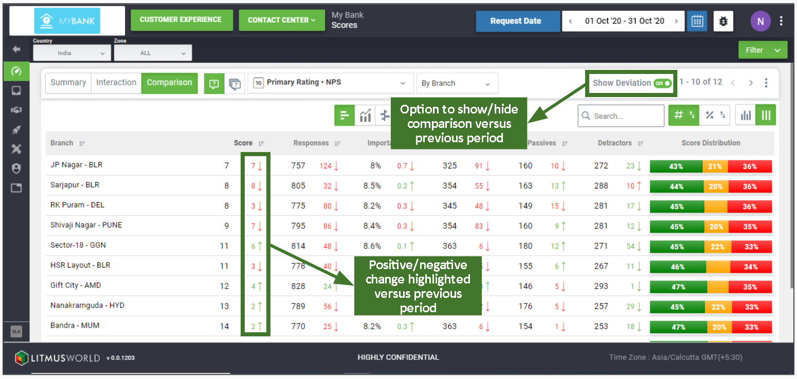
Sort by Value/Difference
The option to download data is available across all widgets on the dashboard which can be accessed using the kebab icon available at the top right corner of every widget and downloads data in CSV format.
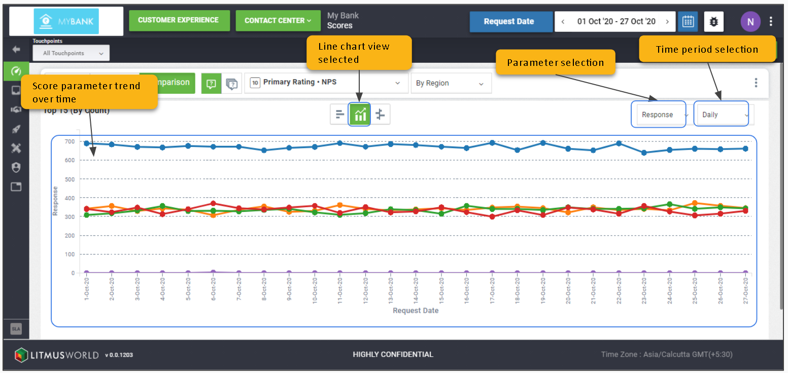
Line Chart View
Click the Graphs/Charts Icon > Line Chart View
The line chart allows you to see the trend of interaction score or its component over the time frame selected. The X axis represents the time frame selected while the interaction score or component details are represented using the Y axis.
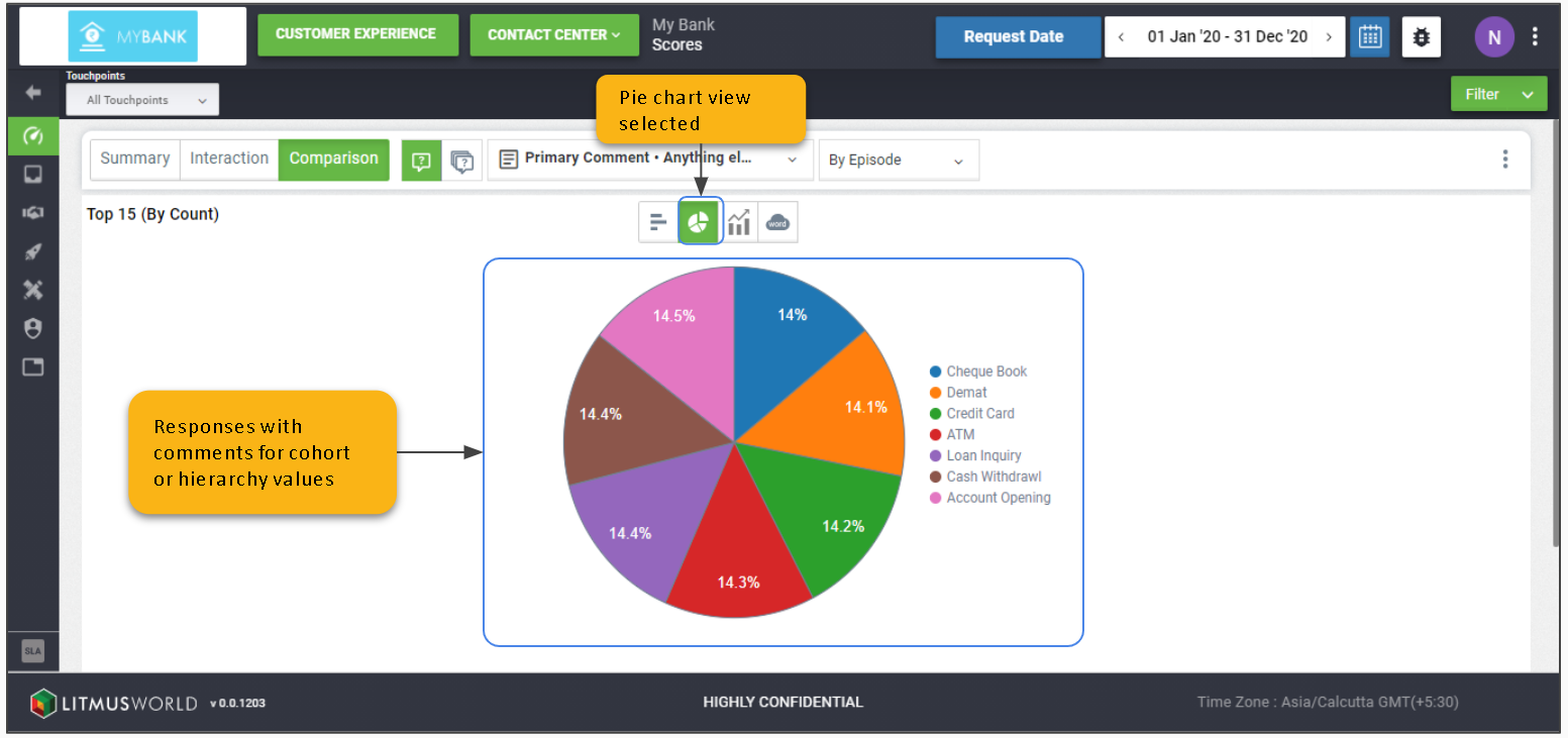
Pie Chart View
Click the Question Selector > Primary Comment
Click the Graphs/Charts Icon > Pie Chart View
The pie chart view is only available for text interactions and provides details on the proportion of customer responses with comments received for top 15 cohort or hierarchy values.
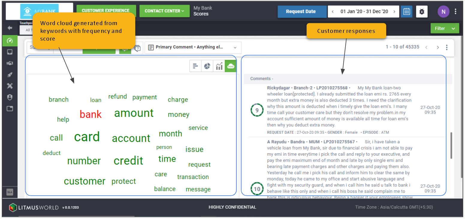
Word Cloud View
Click the Question Selector > Primary Comment
Click the Graphs/Charts Icon > Word Cloud View
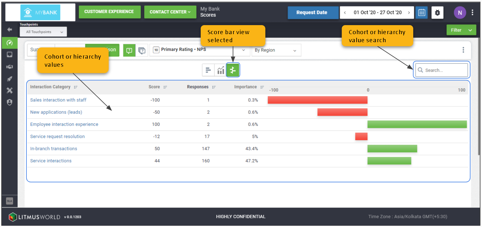
Score Bar View
Click the Graphs/Charts Icon > Score Bar View
The score bar view shows the list of fields based on the cohort or hierarchy selected along with bar charts representing scores over the scale ranging between the maximum and minimum limits for the interaction.